


Introduction
We live in the age of user-centered emotional culture, and the necessity of color as an important component in the environment to improve the quality of urban landscape has gradually increased in this society (Hong, 2014). As the quality of life has improved under the changing conditions in class, culture, age and economic status, the demand for changes in perception and new perspectives on spatial environment has been ever growing. In spite of such changes, consistent and consecutive colors have been overused in color planning, and thus it has been difficult to develop systematic and objective color plans. There is also no sufficient guideline to meet the sensibility of users. In particular, it is necessary to establish detailed plans and methodology in order to create pleasant urban landscapes and to select exterior colors of apartment houses that can satisfy the psychological emotions of humans. Based on them, guidelines for systematic color planning should be developed accordingly. Environmental colors that are applied under systematic plans bring about positive effects, for instance, improving spatial functionality as well as brand images and creating pleasant urban landscapes and environments (Kim, 2003). Thus, this study aims to propose colors using languages that reflect the sensibility of users to ensure they can be used as foundational information for more efficient color planning in environmental design. The results of this study are expected to be utilized as reference by color specialists or actual users. In addition, the spaces planned based on the guidelines will contribute to the improved quality of life of users as places for communications.
Research method
1. Research scope
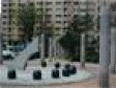
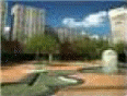
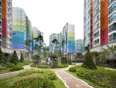
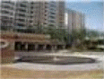
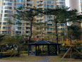
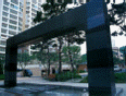
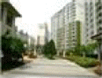
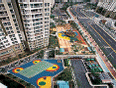
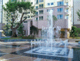
To research and analyze the status of colors used in the outdoor spaces of apartment houses in urban residential districts, relevant literature was reviewed and the current status of 5 target apartments located in Seoul, Gyeonggi-do and Chungcheong-do respectively were researched for the period from April, 2015 to December, 2015. Along with them, on-site surveys were conducted simultaneously (May’Į×November, 2015), and the whole process was recorded using a XA30 digital HD video camera (Canon/Japan) and a Powershot G12 digital camera (Canon/Japan) for analysis. The target sites in this study were shown in Table 1.
Table┬Ā1
Study sites.


2. Systematic analysis of sensibility languages
Since sensibility is intuitive and responsive to external stimuli and subject to change in temporal and environmental conditions, it is difficult to directly grasp the sensibility of people or quantify and measure it objectively. In this case, adjective words can be used to infer the sensibility (Nam, 2003). Through literature review, 662 adjectives were collected, and through frequency analysis and mean-value test, 235 adjectives that appeared relatively less frequently were excluded. The collected 427 words were reviewed by 15 people (fourthyear students majoring in spatial environment, and specialists with 3 years of experience), and 87 words were extracted and 47 words with the frequency level 5 were selected. For a goodness-of-fit test, sensibility color languages were selected based on the study of Hong and Lee (2014) in which words mentioned more than 3 times were filtered through a freeassociation task using relational networks. The final 26 emotional adjectives were selected in consideration of the frequency of words recorded in the process of collecting words (Table 2).
Table┬Ā2
Representative sensibility languages used in this study.
3. Selection of emotional colors
1) Selection of photo images
Structures, apartment houses, landscape, and environmental structures in the target sites were recorded, and over 600 photos were extracted. They were divided by types of outdoor spaces into road, greenery space, facility space and plaza. Since color images of vegetation in greenery spaces sensitively respond to seasonal changes, the areas were viewed as flexible landscape, and colors were extracted from the most variable elements. Since some species show different colors in different seasons in vegetation spaces, their colors were analyzed by season. Structures were separately arranged as surrounding elements. For each language, 20 images were extracted in consultation with 5 experts1). There were possibilities that the same image could be selected under multiple words, and that parts, not the entire image, could be associated with colors. Considering these possibilities, it was allowed to select the same image under multiple words, and 9 images per each of the 26 sensibility languagesŌĆĢin total 234 imagesŌĆĢwere selected. The reason why the number of images was limited to 9 was to make a square-shaped matrix of colors within an analysis frame.
As a preparation for a more accurate color analysis, colors in the backgrounds and natural environment were removed using Adobe Photoshop CS5 (Adobe Systems Incorporated, USA).
2) Selection of emotional colors
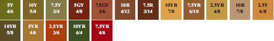
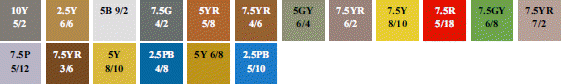
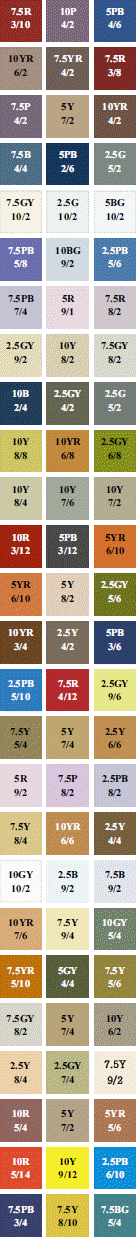
Colors in the extracted photos were analyzed and measured by displaying the photo images on the Photoshop program, and simplifying colors through the process of Filter - Pixelate ŌĆō Mosaic (Cell size: 30 square). The colors were compared with the Munsell color system. Colors on parts of an image of which form, color and texture were matched with sensibility languages were collected using the eye drop tool. If necessary, they were analyzed based on different standards. The selected colors were arranged based on the environmental colors2) suggested by Park et al. (2005). They were arranged in the clock-wise direction (RŌł╝RP) of the Munsell color wheel3), and based on the three attributes of color4), hue was arranged first, and tone5) and chroma were arranged. After that, Munsell color symbols were marked on them (Table 3). Color palette was created in order to maximize the range of choices of paint colors that were actually used on the exterior of apartment houses, and to prevent such choices from being limited to a few colors for the sake of convenience in management. This kind of the combinations of colors can be utilized to arrange colors in various ways in actual fields.
Table┬Ā3
Overall sensitivity matrix of color space.
| Image Hue | Hue |
|---|---|

|

|
| Tone | |

|
|
| Color palette | Brightness saturation |

|

|
On the collected color palette, colors that were matched with sensibility languages were extracted, and arranged in a chart. Through analysis, colors of each sensibility language were suggested. ŌĆ£Color Image Chart (Kim, 2000)ŌĆØ and color arrangement suggestions of Adobe (2015) were used as color sources of sensibility languages in order to select commonlyacceptable colors in an objective way. For each sensibility language, three colors were selected among those that were harmonized with the tone of the target exterior and the colors of natural environment from the adjective color list of the Color Image Chart. The selected colors were arranged on a color image scale.
3) Setting color image scale
A color image scale is an objective criterion for color sensibility. The feelings that are commonly felt by people on color are arranged on horizontal and vertical axes, and a combination of colors and a matched adjective are landed on the two-dimensional square-shaped space that is created based on the two axes (Park, 2007). Out of the three attributes of color, value shows the degrees of brightness and darkness of all colors, and in this step, hard and soft senses6) were arranged on the vertical axis. Warm and cool senses (seasonal and temporal factors) were arranged on the horizontal axis in order to use the psychology of colorsŌĆĢone of the visual-perceptual properties in spatial planningŌĆĢas reference axes (Hong and Lee, 2014). This kind of axis setting is useful to express the landscape of Korea where four seasons are clearly distinguished with a cycle of three cold days and four warm days (Fig. 1).
Fig.┬Ā1
The reference axis of color image scale. Note: Adapted from ŌĆ£Conclusion of emotional language for space considering urban image.ŌĆØ by I.K. Hong and J.H., Lee., 2014., J. Kor. Soc. Floral Art & Design. 30:59-82. Adapted with permission.

Results and discussion
1. Analysis of colors by photo type
The results of analysis on types of outdoor spaces were shown in Table 4. Road spaces had Y, G and YR colors, and p, sf, lt and dl tones. Non-seasonal colors such as GY and G were mostly used in greenery spaces, and some seasonal changes were added with different species. The colors of spring plants included GY (associated with sprouts and buds), RP and R (associated with cherry tree, royal azalea and azalea), and Y (associated with forsythia), and v, lt and s tones were extracted. In summer, GY and G colors associated with leafy forests, and R, P and YR colors associated with colorful flowers dominated the season, and v, lt, st and dp tones were extracted from natural images. The colors that represented autumn included R, YR, Y and GY (associated with maple, ginkgo, zelkova, and fallen leaves of other broadleaf trees), and v, s, sf, dl and dp tones were extracted. In winter, GY color and dl and dp tones were extracted from needleleaf trees, and YR color and sf, gr, dl and dk tones were extracted from deciduous broadleaf trees. R, Y and B colors, and v and s tones were mostly used in childrenŌĆÖs playgrounds among facility spaces, to give childrenŌĆÖs playful image. Different colors with lt, s and dp tones were used on their ground. For sheltered spaces, benches and tree guards in relaxation areas, wood or stone materials with Y and YR colors were mostly used. In plaza spaces, GY color of grass was extracted, and YR and Y colors were also used.


2. Selection of candidate colors by sensibility language
26 sensibility languages that represented the outdoor spaces of apartment houses were placed on a color image scale, and 3 candidate colors for each language were selected as shown in Table 5. However, some selected colors that are restricted in the Environmental Colors can be used as focus colors within the target landscape. Under the premise, when such colors need to be used for certain highlighted areas and the own identity of certain outdoor spaces, less excessive high brightness/ mid-chroma colors are allowed to some extent in order to maintain a harmonized atmosphere. Table 5 shows the selected colors and tones for each sensibility language: p and lt tones with Y and GY colors for ŌĆśsoft,ŌĆÖ ŌĆścomfortable,ŌĆÖ ŌĆśintimate,ŌĆÖ and ŌĆśstaticŌĆÖ; s tone with Y, YR and GY colors for ŌĆśamicable,ŌĆÖ ŌĆśnatural,ŌĆÖ ŌĆśhealthy,ŌĆÖ ŌĆścosy,ŌĆÖ ŌĆśstableŌĆÖ and ŌĆśharmoniousŌĆÖ; s and v tones with R and PB colors for ŌĆśglossy,ŌĆÖ ŌĆśdynamicŌĆÖ and ŌĆśactiveŌĆÖ; dl tone with YR color for ŌĆśluxurious,ŌĆÖ ŌĆśelegant,ŌĆÖ ŌĆśnobleŌĆÖ and ŌĆśdignifiedŌĆÖ; p tone with R, PB and GY colors for ŌĆśopen,ŌĆÖ ŌĆśbright,ŌĆÖ ŌĆśgracefulŌĆÖ and ŌĆśgorgeousŌĆÖ; s and dl tones with PB colors for ŌĆśrefined,ŌĆÖ ŌĆśsensualŌĆÖ and ŌĆśexcitingŌĆÖ; and dl and dp tones with B and G colors for ŌĆśartificialŌĆÖ and ŌĆśurban.ŌĆÖ The 78 colors were selected among urban image colors in consideration of relations with environmental colors, and each color can be modified into dominant, base, and accent colors if necessary.
Table┬Ā5
Emotional language proposed by color.
3. Creation of color image scale for emotional colors
The palette was suggested through the analysis of currentlyused colors for the outdoor spaces of apartment houses. Based on the palette, photo images were classified by sensibility language, and 3 colors were suggested for each sensibility language. The selected emotional colors of each language were arranged on the color image (Fig. 2).

As shown in Fig. 2, ŌĆśsoft,ŌĆÖ ŌĆścomfortable,ŌĆÖ ŌĆśintimate,ŌĆÖ ŌĆśstatic,ŌĆÖ ŌĆśamicable,ŌĆÖ ŌĆśnatural,ŌĆÖ ŌĆśhealthy,ŌĆÖ ŌĆścosy,ŌĆÖ ŌĆśstableŌĆÖ and ŌĆśharmoniousŌĆÖ were landed in the first quarter of the ŌĆ£Soft ŌĆō WarmŌĆØ section. ŌĆśGlossy,ŌĆÖ ŌĆśdynamicŌĆÖ and ŌĆśactiveŌĆÖ were located in between the ŌĆ£warmŌĆØ horizontal axis, and the ŌĆ£Soft ŌĆō HardŌĆØ vertical axis. ŌĆśLuxurious,ŌĆÖ ŌĆśelegant,ŌĆÖ ŌĆśnobleŌĆÖ and ŌĆśdignifiedŌĆÖ were landed on the fourth quarter of the ŌĆ£Hard ŌĆō WarmŌĆØ section. ŌĆśOpen,ŌĆÖ ŌĆśbright,ŌĆÖ ŌĆśgracefulŌĆÖ and ŌĆśgorgeousŌĆÖ were located in the second quarter of the ŌĆ£Soft ŌĆō CoolŌĆØ section, ŌĆśrefined,ŌĆÖ ŌĆśsensualŌĆÖ and ŌĆśexcitingŌĆÖ were located in between the ŌĆ£CoolŌĆØ horizontal axis and the ŌĆ£Soft ŌĆō HardŌĆØ vertical axis. ŌĆśArtificialŌĆÖ and ŌĆśurbanŌĆÖ were located in the third quarter of the ŌĆ£Hard ŌĆō CoolŌĆØ section. It was found that the selected languages and colors were all landed within the four quarters of the color image scale, and that most of the sensibility languages were located with in the first’Įźforth quarter of the scale (ŌĆ£Soft ŌĆō WarmŌĆØ section). This indicates that Korean people are still favorable to warm colors such as YR and Y, and neutral colors such as GY.
Conclusion
In the age of emotional culture, sensibility should not be excluded from exterior color planning, and the criteria for the general image scale without sensibility reflected are inevitably vague, and the languages and scope expressed with the criteria cannot be accurate. This study started with the issue and it is necessary to suggest the emotional color image scale suitable for outdoor environments as color planning guidelines and an objective evaluation tool at this point of time.
The psychological properties of color and their standards elements were extracted first, and the base axes of an emotional color image scale were determined. The final sensibility languages were selected through literature review, pre-analysis and expert evaluation. All types of colors extracted by analyzing photo images by sensibility language were categorized, and three colors for each sensibility language that were matched with the outdoor environment of the target apartment houses were selected. The number of adjectives arranged on the color image scale was 26 in total, and 78 colors were selected through the analysis of sensibility languages. The extracted colors and sensibility languages were landed on the four quarters of the scale. This study suggested colors that were matched with the natural environmental colors of all four seasons and that could reflect the images and identify of apartment houses. It is hoped that this can change the recognition of experts who are dealing with environment. The results of this study will contribute to bringing about positive effects to urban landscape, and suggesting objective and systematic colors as a tool for communication and information delivery. If more objective criteria and differentiated colors depending on the characteristics of target sites can be suggested through follow-up studies on the relations between colors, it will further contribute to the improvement of the quality of life through mutual communication with users.